Recently, we talked here about creating a great centerpiece, and here’s an encouraging postscript: those same design principles apply to just about any decorative grouping you’d make in your home!
The principles are UNITY and VARIETY. We’ll also talk a little about symmetry (yes or no?) Expanding from thinking about table centerpieces, let’s see how these ideas apply to say, a grouping on a console or chest.

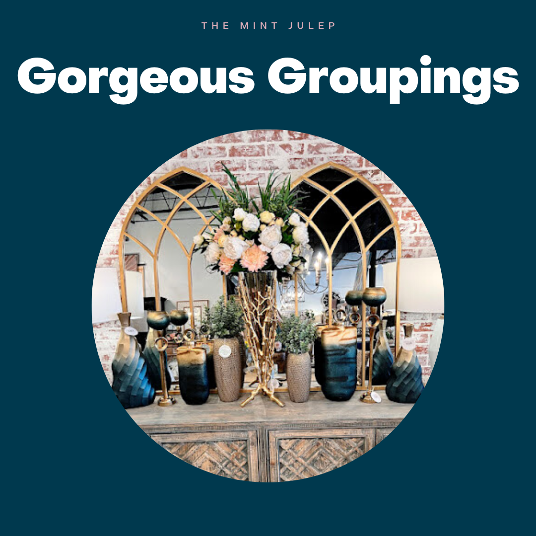
The creator of this arrangement set the stage with a background of gold cathedral window mirrors and began with the central focus, a stunning gold twig vase of florals. Notice how the element of unity (gold tones) is already working? To continue this theme, she added gold candlesticks and gold-accented blue decorative vessels. The blue tone is repeated across the console top, adding another layer of unity–color.
Now for the variety: notice that although the blue vases are similar, they aren’t exactly the same. In addition, the items all vary in height and shape. Textures in the arrangement differ, as well, from smooth glass to plant life.
Have a look at another console arrangement.

Can you analyze how unity was achieved in this grouping? There are at least a couple, including the color white, and the use of wood tones. See the distressed white lamps with wood peeking through, the white and wood candleholders, the white vase, the wood frame and jar lids…?
Now look how variety works its magic. Again, there's a height difference among the elements, which keeps the eye moving across the arrangement. Also notice the variety from distressed wood being juxtaposed with smooth glass jars and flower vase.

It’s not hard to determine that black is the unifying element of this grouping! The black map art suggests the theme, and the black lamps, candleholders, vases and lanterns complete it. But variety prevents it from being too predictable—you see different shapes, heights, and even a difference in sheen, from matte to shiny. While the greenery does repeat for unity, it differs in texture and shape, and sits on varying levels—for variety!
Does these tips give you ideas for your arrangements?
A related issue arises when our Mint Julep clients want advice about symmetry. Should you try to match pieces–or mix? We think the answer is to have the best of both! For a console grouping, for example, your can’t go wrong when you begin with paired lamps at either end to bookend your grouping. Then have fun mixing it up when adding your pieces in between!


Here, lamps flank a happy and diverse mix of accent pieces in varying heights and shapes. See? Not hard to duplicate this look!
You’ll observe that another path to unity is having the tabletop items take their cue from the painting that anchors the grouping. In both settings above, gold decorative items repeat the gold highlights in the artwork.
Let your artwork set the color scheme for your groupings!

(Loving the pink and silver here!)

How would some of the ideas shared play out on a smaller scale? Check out these examples on chests and tables.

For unity: white elements
For variety: smooth vases vs filigree frame, tall sculpture vs short vases

For unity: painting colors repeated in florals
For variety: square frame vs rounded vase, florals taller than artwork

For unity: white repeated in vase, art, lantern and candlesticks; wood repeated in frame, tray, bowl
For variety: height and shape of pieces, different materials (wood, ceramic, plants)

For expert advice on your decorating questions–and tons of inspiration for your groupings–stop by the Mint Julep on Ridge Road in Rockwall. Or visit our redesigned website to easily shop our online collections 24/7!